
When I first started designing my portfolio website, I knew one thing for certain: the colours would play a pivotal role in creating the right vibe. After all, the colours you choose aren’t just about aesthetics—they communicate your brand, set the tone, and guide the overall user experience. And so, my colour palette became an exciting journey of trial, error, and finally, discovery.
Setting the Scene: The Dark Theme Vision
From the very beginning, I was drawn to the idea of a dark-themed design. There’s something elegant and timeless about dark tones that really allow the content to shine. I didn’t want the design to compete with my work but to enhance it. Dark backgrounds, complemented by carefully chosen accents, can make all the difference in how the content is perceived.
But how could I make sure the palette I chose would not just “fit,” but feel right? After a lot of experimenting, tweaking, and testing, I landed on four colours that spoke to me and worked together in perfect harmony:
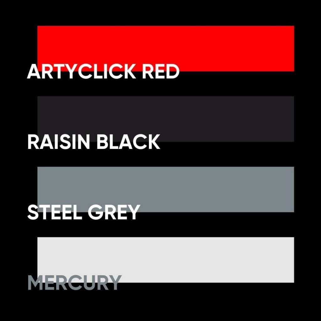
- ArtyClick Red (#FD0000)
- Raisin Black (#1F1D20)
- Steel Grey (#7A8489)
- Mercury (#E5E5E5)
The Magic Behind the Colours
Each colour in this palette was carefully selected with purpose. Let me walk you through the choices:
- ArtyClick Red (#FD0000): The bold and the beautiful! ArtyClick Red is, without a doubt, the star of the show. It’s the brightest red in the spectrum, and I can’t get enough of it. This red is alive—it grabs your attention and draws you into the experience. It’s the primary colour on my website, and you’ll see it everywhere, from buttons to headings, ensuring that every action point pops and feels energetic.
- Raisin Black (#1F1D20): Think of Raisin Black as the quiet strength that holds everything together. This dark shade acts as the backbone of the design. It’s rich, deep, and provides a perfect contrast to the brighter elements, giving my website a sense of depth and mystery. It’s the ideal backdrop for my work to stand out.
- Steel Grey (#7A8489): A sophisticated neutral, Steel Grey is the perfect balance to the boldness of ArtyClick Red. It’s calm, composed, and used for things like text, icons, and secondary elements. I wanted something understated yet polished, and Steel Grey delivered just that, adding a touch of professionalism without taking over.
- Mercury (#E5E5E5): This soft off-white shade is like a breath of fresh air amidst the dark tones. Mercury is used sparingly to highlight certain areas and provide contrast. It’s a subtle, clean touch that allows the other colours to pop and adds clarity where needed.
A Personal Touch: Why ArtyClick Red Means So Much
Out of all the colours, ArtyClick Red holds a special place in my heart. It’s not just any red—it’s vibrant, intense, and unforgettable. To me, this colour symbolises creativity, passion, and boldness—values I want my portfolio to convey. It’s the heartbeat of my website, and I’ve made sure it’s front and centre.
Whenever I see ArtyClick Red on my site, I’m reminded of the journey I’ve taken as a designer and the excitement I hope to pass on to my visitors. It’s a colour that says, “I’m here, and I’m ready to make an impact.”
You can experience the full effect of this colour palette on my website at https://sheshan.online. Take a look!
The Result: A Cohesive, Bold, and Professional Look
After all the time spent on experimenting with colour combinations, the final result is a website that feels cohesive and aligned with my personal brand. The dark theme, punctuated by ArtyClick Red and complemented by the calm neutrality of Steel Grey and Mercury, has created a striking and professional look that I’m proud of.
Each colour choice brings something unique to the table, working in harmony to enhance the user experience and make the website a pleasure to explore.
Takeaways: Colour Matters More Than You Think
If you’re designing your own website, one of the most important lessons I learned during this process is just how much colour matters. It’s not just about what looks good—it’s about creating a visual language that communicates who you are and what you stand for.
The right colour palette can transform your website from just a page of content to a true reflection of your personality and your work. So, don’t rush the process. Experiment, trust your instincts, and most importantly, make it your own.
Thanks for reading! I’d love to hear your thoughts on colour in design—feel free to share your experiences or ask any questions in the comments below!
