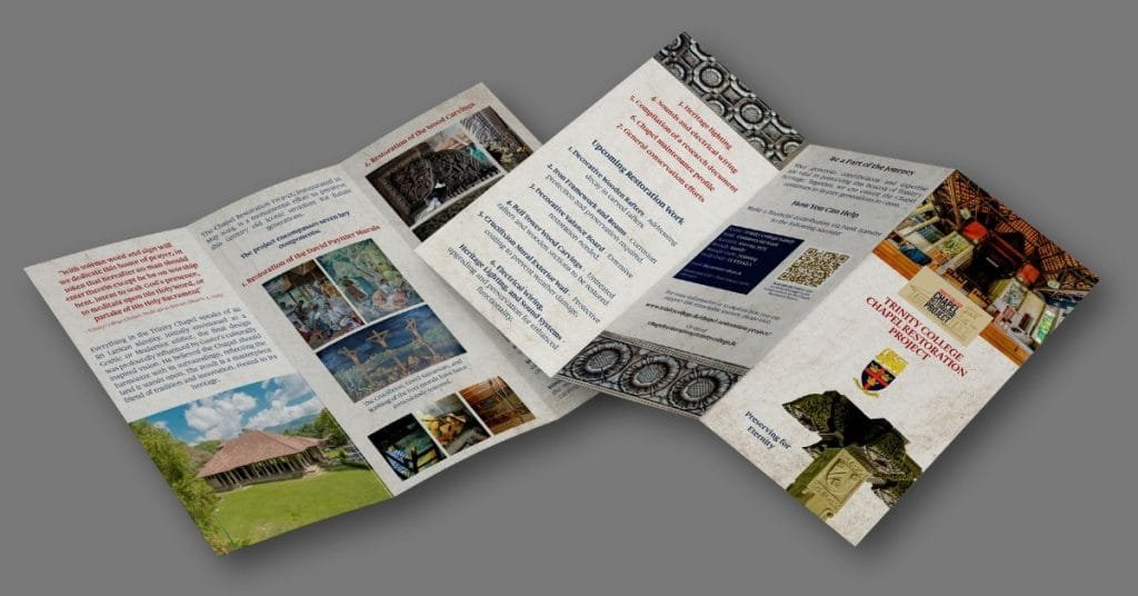
Designing a brochure that captures the essence of a historic building while maintaining a modern, clean aesthetic is always an exciting challenge. For my latest project, I had the privilege of creating a tri-fold brochure for the Chapel of Trinity College Kandy—a stunning architectural landmark with a rich history.
What made this project even more special? It was my first-ever tri-fold brochure that went to print! In this post, I’ll walk you through the design process, from gathering inspiration to the technical steps that brought the final product to life—all completed in just two hours.
Inspiration Behind the Design
Before jumping into the design work, I took a step back to understand the Chapel’s significance and how I could visually represent its history and architecture. The Chapel of Trinity College Kandy, with its rich heritage and stunning granite structure, offered plenty of inspiration. I wanted the brochure to feel as timeless and elegant as the Chapel itself.
The most prominent feature I drew inspiration from was the Chapel’s granite facade, which I translated into a textured background for the brochure. This connection to the Chapel’s physical space made the design feel more immersive and meaningful. I also used an image of a pillar from the Chapel, removing the background to make it stand out as a key design element on the front panel.
Breaking Down the Design Process
Step 1: Gathering the Information
To start, I gathered all the text and images that would go into the brochure. With a tri-fold design, there are six panels to work with, which means balancing text, images, and negative space carefully. The text needed to be concise but informative, so I broke it down into smaller chunks to fit into each column. I had to ensure that the layout remained clear and easy to read while still capturing the essence of the Chapel’s history.
Step 2: Setting Up the Document
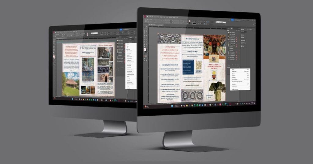
Next, I set up the document in Adobe InDesign, which is my go-to tool for projects like this. One of the key decisions I made early on was to use a 0.125-inch bleed. A bleed is important for print projects because it ensures that there are no white edges when the brochure is trimmed. By extending the design slightly beyond the trim area, I made sure the colors and images would go all the way to the edge of the paper without any awkward borders.
I also made sure to set the margins at 0.16 inches. This gave the content enough breathing room and helped maintain a professional look. The 0.16-inch margin is a standard setting for print designs, ensuring there’s enough space around the edges of each panel without crowding the text or images.
Step 3: Laying Out the Design
With the document set up, I began laying out the brochure. For a tri-fold design, each panel must flow logically, with each section building on the next. I began with the front panel, which is often the first thing people see. This needed to be the most visually striking panel to grab attention. I placed the Chapel’s pillar image here and layered it with the textured granite background to give it depth.
For the inside panels, I focused on balance. Since the brochure had a lot of text to fit, I experimented with different ways to display the content, from standard text boxes to more dynamic, masonry-style layouts for images. This allowed me to keep the design looking clean and organized, even with so much information.
Step 4: Image and Text Balance
One of the biggest challenges in designing this brochure was balancing the text with the wide-angle photos of the Chapel. Tri-fold brochures often need to fit a lot of content, and finding a way to showcase the images without overcrowding the design was crucial. I decided to use a mix of full-width images and smaller, more controlled image blocks, which helped prevent the layout from feeling too heavy or cluttered.
To maintain readability, I kept the text in short, digestible paragraphs, using headings to break up the content. I made sure the font size was large enough to be legible, but not so large that it overwhelmed the design.
Key Design Features and Technical Details
Fonts and Typography
I decided to do the entire brochure in one font: Gauthier – a typeface that reflects the subtleness of the Chapel itself. Consistent font pairing helped maintain visual hierarchy and made the brochure easy to navigate.
Color Palette
For the color scheme, I drew inspiration from the natural tones of the Chapel’s granite and surrounding environment. Earthy, neutral tones—grays, soft whites, and subtle blues – dominated the design, with accents of dark brown to complement the images. The color palette not only made the brochure feel cohesive but also tied the design back to the Chapel’s architectural style.
Ensuring Print Quality
Another important step was ensuring the final design would look great when printed. This meant checking that all images were high-resolution (at least 300 DPI) and making sure that the color mode was set to CMYK, which is the standard for print projects. I also proofread the entire document multiple times to catch any errors before sending it off for printing.
The Final Product
Once I was happy with the design, I exported the document as a print-ready PDF with all the necessary settings: 300 DPI resolution, CMYK color mode, and crop marks for the printer.
Conclusion: A Brochure That Connects
In the end, my goal was to create a brochure that wasn’t just visually appealing, but also connected the reader to the Chapel of Trinity College Kandy. I wanted the design to feel like an extension of the Chapel’s own architecture, making the brochure not only a source of information but also an experience in itself.
This project taught me a lot about the balance between creativity and technical precision in print design. I’m incredibly proud of how the brochure turned out, and I look forward to tackling more design projects like this in the future.