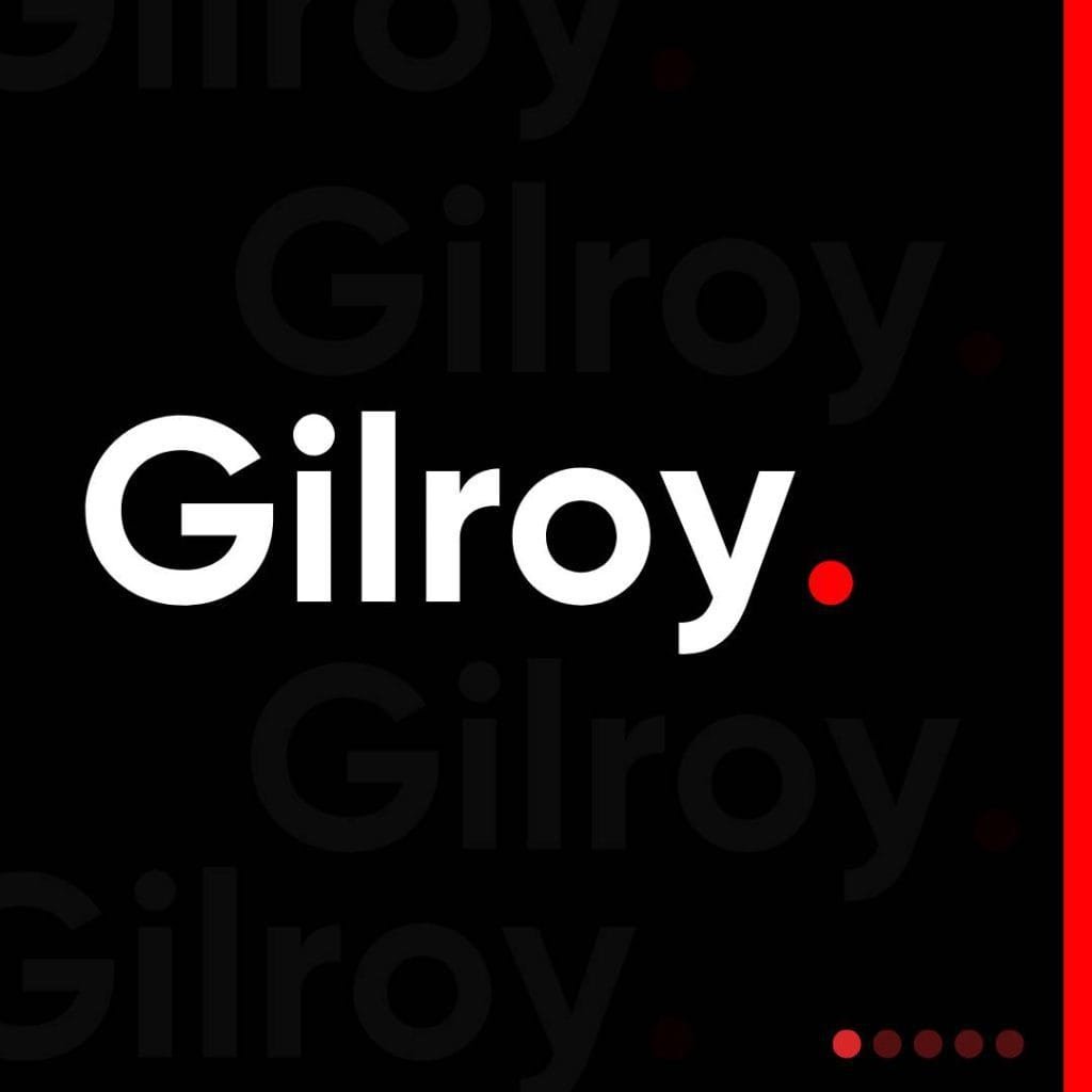
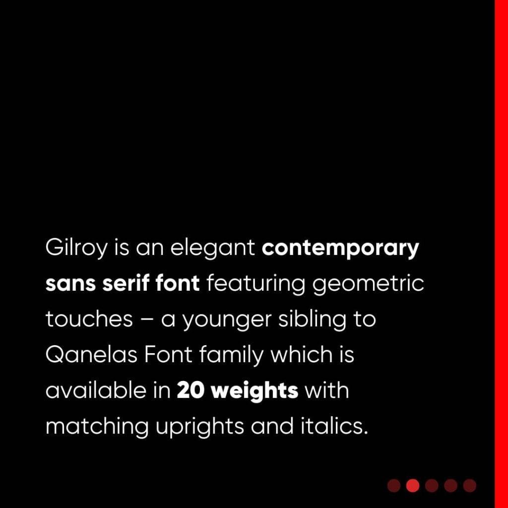
When it came to choosing a font for my personal portfolio and business card, I wanted something that was more than just visually appealing. I needed a typeface that resonated with my approach to design—modern, versatile, and impactful. That’s when I discovered Gilroy, a contemporary sans-serif font designed by Radomir Tinkov. It has since become the cornerstone of my brand identity.
What drew me to Gilroy was its perfect blend of minimalism and elegance. Its geometric design and clean lines offer a modern aesthetic that feels fresh without being overly trendy. This balance makes it ideal for both print and digital mediums—whether it’s a business card in hand or a portfolio viewed on a screen.
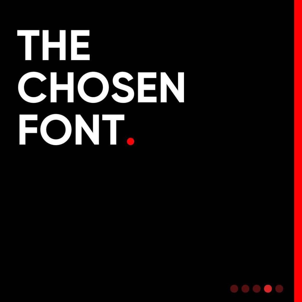
The Thought Behind the Choice
Typography is more than just letters on a page; it’s an essential part of how a message is delivered and perceived. With Gilroy, its light and extra bold weights available for free were perfect for experimentation. From subtle accents to bold headlines, the font adapts effortlessly.
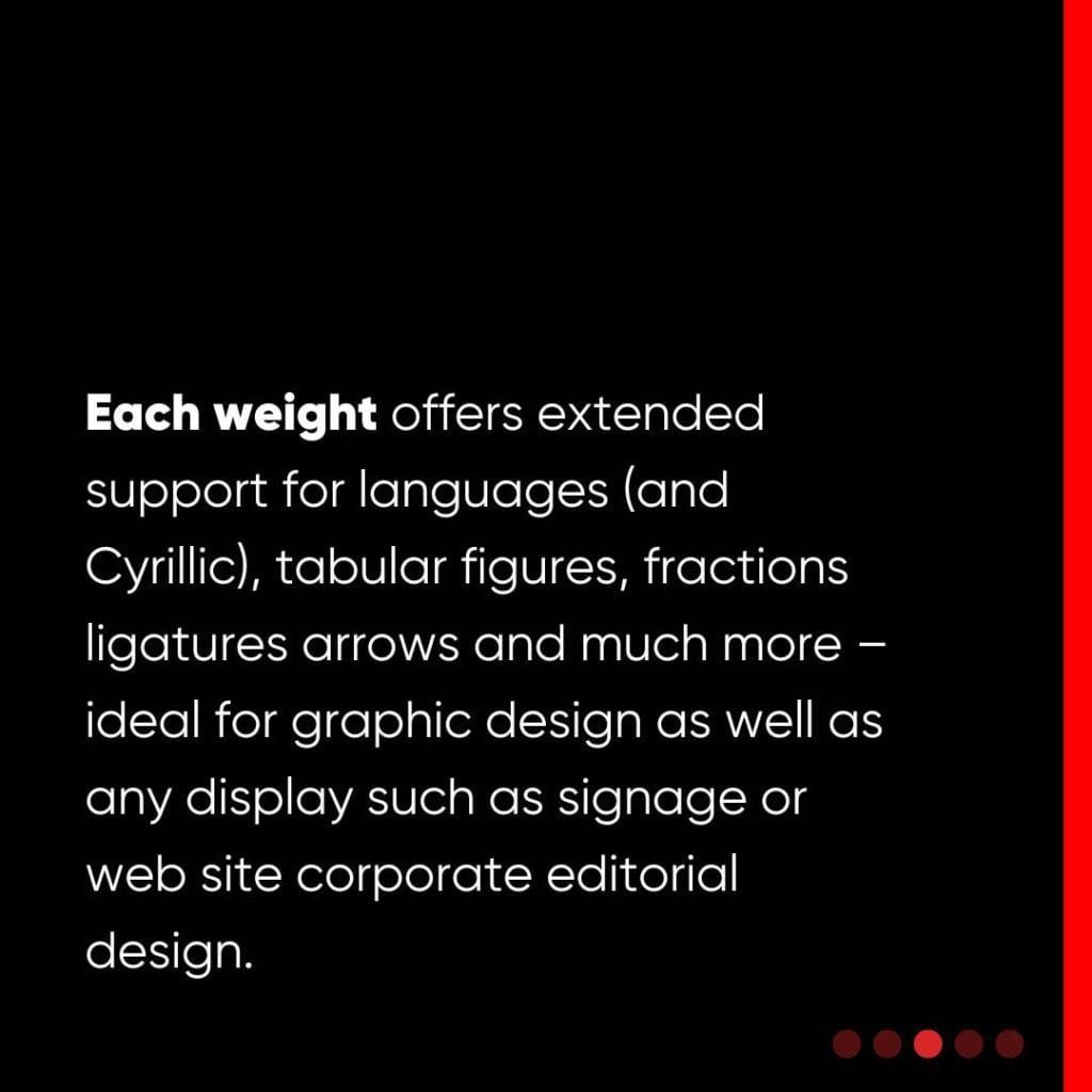
Additionally, its extensive language support and features like ligatures and tabular figures meant it wasn’t just beautiful but highly functional. These qualities made Gilroy a versatile tool for creating a cohesive and professional brand presence.
A Nod to Its Creator
Radomir Tinkov’s generosity in offering parts of Gilroy for free speaks to his passion for accessible design. The font’s younger sibling status to the renowned Qanelas family makes it even more special—bringing sophistication with a modern twist.
For me, Gilroy isn’t just a font; it’s the visual voice of my brand. Every time I see it on my website or business card, it reminds me why design matters: simplicity, clarity, and connection.